The Timber Trail
Interpretation along one of the most popular sections on the Ngati Haerenga New Zealand Cycle Trail
One of our largest and most exciting projects was developing the interpretation along the Timber Trail, now one of the most popular routes in Nga Haerenga The New Zealand Cycle Trail. Snapper Graphics won a national tender process and created a comprehensive suite of interpretive signs and sign frames geared to cyclists, combining stories of social history, ecology and timber industry in an innovative way. All along the 84km long trail, users can use the ‘sign stops’ to catch their breath, wait for mates, or take in the view, while checking out the stories.
It seems to have worked:
About the Timber Trail
This 84km cycleway runs from Pureora, near the tiny settlement of Bennydale, through the Pureora Forest Pak to Ongarue. This is a remote, quiet area, nestled between Lake Taupo, Te Kuiti and Taumaranui. At the time the Department of Conservation was putting together the case for this to be part of the Nga Haerenga Cycle Trail project this area had been in decline for decades. Loss of employment options in mining and forestry, loss of population and services had turned this part of the country into a ‘forgotten corner’. Exactly the type of place that the cycle trail project was hoping to bring to life. And it did. Accomodation, bike rental and shuttle services have sprung up, this trail has proven so popular, it is hard to keep up with developments. Even while Covid19 limits international tourism, this stunning trail will bring new Zealander back time and again.
A suite of sign frames
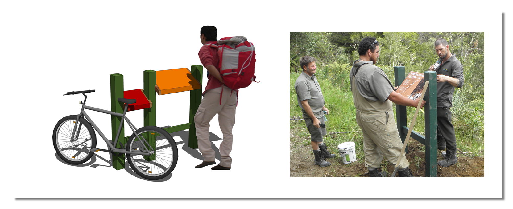
We had learnt from our work on the Ohakune Old Coach Road (2008) that cycle trails need specific sign frames - when you’re cycling along and decide to wait for your mates to catch up, you don’t get off your bike. You find somewhere to put your foot so you can stay upright. This works great on timber bridges with a ‘halfway up’ rail, with a big boulder, or with a sturdy sign frame that has a foot rest built in. Similarly, if you do decide to stop, you don’t throw your bike in the mud, you lean it against something, if possible. A sign stand is useful - so it makes sense to design it in such a a way that it can handle a bike being leaned against it.
These two observations led us to a suite of sign frames that was adopted all along the trail.


Three themes
We received a mountain of information from the project team at DOC and from local mana whenua. Not only is Pureora the place where all stages of the history of the timber extraction history of New Zealand have played out, often in dramatic fashion, the area has some stunning social histories to share - maori and pakeha stories, and the natural heritage - the birds, the trees, the wildlife is incredibly diverse.
Some of the material we had available


We developed a sign layout system that reflected the three main themes: brown for the timber industry, green for the ecological stories and red for the social history.
And we came up with a central graphic device that represents both the contours of a mountain (pureora) as the rings of an old tree
Locating the signs
In total a stunning 90 signs were created for the trail. This seems like a lot, but spread out along such a long route, and with higher concentrations in the areas where a greater need is expected, large part of the trail are still uncluttered. the signs are all placed at natural stopping points: at bridges at the end of a climb, or at a major feature.
Tramway
A big feature of the southern part of the Timber Trail is the former timber 35km long tramway, which was designed to bring the felled timber down to the Ongarue Mill. As the cycle trail hits this former tramway, special ‘road signs’ highlight the features.
Enthusiastic vloggers show appreciation for our efforts:
A selection of our favourite signs:
What did not happen (yet)
As part of our proposal we developed an idea for a major entrance structure, which was to include interpretive displays and would provide a great selfie spot for people’s videos and photos. At the time of opening the trail this was judged as too elaborate and expensive, but. Who knows, the Timber Trail may now be ready for it?
Credits
Client: Department of Conservation - John Stock, Neville Ritchie and the team from the Te Kuiti Conservancy
Design: Snapper Graphics - Jan Ramp (design), Alex Stone (text), Mike Codling (illustrations), Jackie O’Brien (research)
Sign panels: Brave Design
Sign frames and installation: DOC staff
What do you think of this project?


